When it comes to designing a productive workplace, one of the most often overlooked factors is the color of the walls. The colors surrounding us can influence our mood, energy levels, and focus, making it crucial to choose the right commercial painting colors to boost productivity.
Understanding Color Psychology in the Workplace
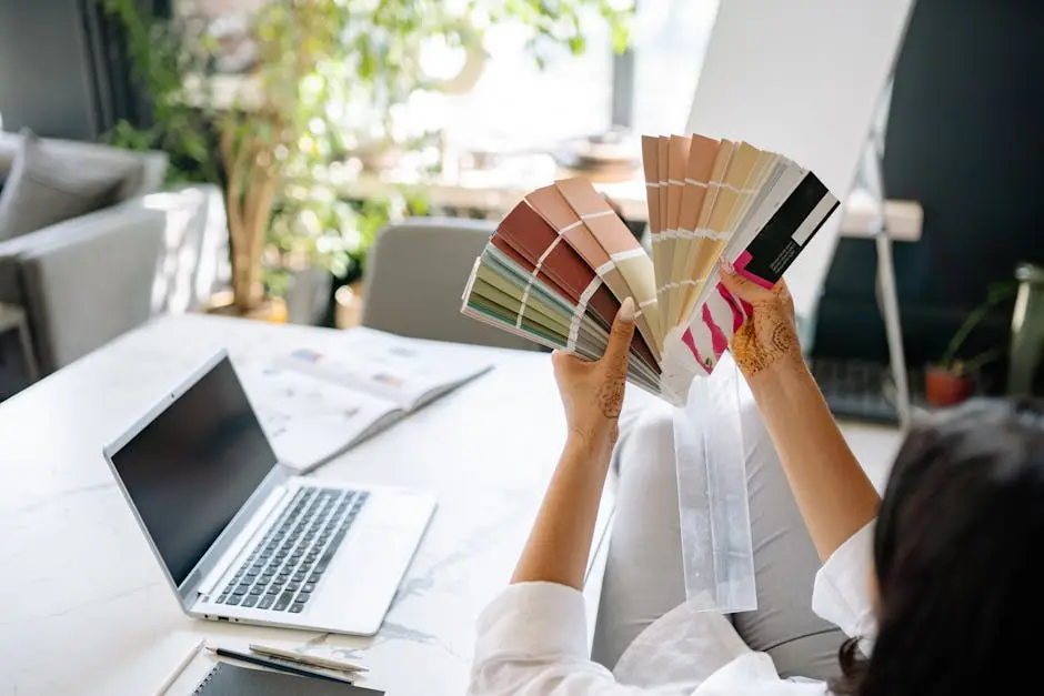
Colors can have a profound effect on our behavior and emotions. Understanding basic color psychology is the first step towards selecting the right hues for your commercial space. For instance, blue is known for its calming effects and its ability to boost concentration and creativity, making it a popular choice for office environments. However, it’s also crucial to consider the tone and brightness, as darker shades might feel more somber and less inspiring. On the other hand, warmer colors like yellow and orange are associated with warmth and optimism. They can increase energy and enthusiasm, which might be perfect for creative meetings or brainstorming sessions. Each color evokes different reactions, and knowing these can help tailor the workspace to specific tasks or objectives.
Furthermore, the significance of cultural perceptions cannot be understated. Different cultures associate varying meanings with colors. For example, while white is commonly associated with purity and cleanliness, in some cultures, it might be linked to mourning. Hence, it’s essential to take into account the cultural aspect when designing a workplace intended to accommodate a diverse team. The choice of color should align with the message and feeling you wish to promote in your workspace, resonating positively with everyone who enters.
The Best Colors for Productivity in Offices
Productivity can be significantly enhanced by choosing colors that are known to promote focus and energy. We’ll explore some of the best colors for office spaces that can help increase both efficiency and creativity. White walls often stand as a default but can sometimes be overly stark if not softened by other elements. Instead, try using shades like light pastel blues for enhanced focus during challenging tasks. Greens are another excellent choice due to their soothing associations with nature, which leads to improved concentration and fewer eye strains. When paired with natural light, green can create a refreshing workspace that enhances mental clarity and stability, making it an ideal color for long work hours.
Additionally, consider introducing splashes of red to energize and increase alertness. This vibrant color is particularly effective in spaces where physical activity or quicker decision-making is required. However, it should be used sparingly as too much red might increase stress levels. Color psychology heavily suggests the right balance between colors to achieve the desired psychological response. Mixing these energizing colors in the right proportions could help design a dynamic and versatile workplace environment conducive to various activities.
Using Accent Colors to Enhance Mood and Motivation
While primary wall colors play a key role, accent colors can also contribute significantly to motivation and mood enhancement. Learn how to effectively use accent colors for an uplifting office environment. By tapping into accent colors, you can create focal points that attract attention and inspire energy and engagement. For example, an accent wall in bright orange can instill enthusiasm and innovation. Alternatively, adding splashes of purple can spark creativity, making it beneficial for companies in creative industries looking to push the envelope. The strategic use of bolder and brighter tones not only breaks monotony but also subtly influences the emotions and perceptions of the occupants.
Besides the walls, consider using accent colors in office furniture, decor, and art pieces. Adding accents through cushions, throws, or even colorful office supplies can maintain visual interest without overwhelming the space. Accent colors are powerful tools in the designer’s arsenal, often providing that extra lift needed for motivation and inspiration. It’s essential, though, to ensure these colors are woven seamlessly into the overall design to avoid clashing or chaotic aesthetics.
Combining Colors for a Balanced Work Environment
Creating a harmonious and balanced workspace is essential. Discover how to combine different colors in a way that complements each other and supports your commercial needs. Start by considering complementary and analogous color schemes that naturally enhance one another. For example, a blue-green palette can provide a calm yet refreshing atmosphere, while a combination of red and green can bring energy without overwhelming the senses if balanced correctly. The art of combining colors is about achieving equilibrium between stimulating and calming effects to maintain an optimal work environment.
When combining different tones, testing samples is key. Institutional spaces often benefit from lighter shades to open up areas and maximize the perception of space. Earth tones can ground a space and evoke stability and structure. By unifying these colors with neutral hues like grays, whites, or beiges, you can effectively create a backdrop that fosters focus while allowing accents and personal touches to express individuality. Color balance is crucial in avoiding visual strain and ensuring smooth transitions between different zones in an office layout.
Practical Tips for Implementing Color Changes in Your Commercial Space
Once you have chosen the right colors, it’s time to think about implementation. We provide practical advice on how to easily incorporate new colors into your commercial space. Before embarking on your painting project, consult with professionals immediately to evaluate how lighting, furniture, and space utilization might affect your chosen palette. It’s also vital to create a mood board or mock-up to visualize how the colors will play together, allowing adjustments before application. Engaging employees in the decision-making process can provide insights into preferences and select palettes that resonate widely across the team.
A phased approach might be beneficial when implementing drastic color changes. Start with high-traffic areas like lounges or conference rooms to observe the impact before committing to larger areas. Keep in mind maintenance as well; lighter colors might need more frequent touch-ups compared to darker tones. Consider using sustainable and non-toxic paints to ensure a healthy workplace environment. To transform your office with professionalism and creativity, reach out to All Quality Painting for personalized solutions that align with your color strategy and commercial painting needs.
Bringing It All Together for Maximum Productivity
Bringing the right colors into your commercial space can significantly impact not only the aesthetics but also the productivity and well-being of your employees. Understanding the key principles of color psychology allows you to craft an environment that is conducive to focus and innovation. As you plan your next office overhaul, remember that the perfect color palette is just a brushstroke away. Visit All Quality Painting to explore how you can transform your workplace with the perfect hues.